There are many reasons why you may want to improve a WordPress website.
- It may not look snappy enough
- It could be slow
- It may not be ranking well
- You may not be making referrals or sales
- Or perhaps you just want to add some extra features
We are going to address all of these problems and more. So sit back, grab a cup of coffee and let’s get started on how to improve a WordPress website.
Presentation And Readability

This is a really huge area you should be concerned about. Why? Because if your website and your pages/posts don’t grab your readers attention or they are not very readable, you’ll have a very hard time keeping their attention
What happens? If your pages look like a book, like a sea of text, your readers will get bored very quickly.
If you’re on the opposite end of the spectrum and your pages look like a coloring book with different colors everywhere or blinking eye candy all over the place, your reader will get distracted and you’ll never get your point across.
So how do you fix this and come up with a layout that’s pleasing to your readers?
Your page layout and colors
Its been proven over and over again that the best combination of colors is black text on a white background. Using different colors for your text and background can be hard on the eyes and many people just don’t like it.
Look at from your reader’s standpoint. They are likely searching for some type of information and if it’s hard to read or the colors are distracting you’ll not get your point across or you’ll lose them completely.
You should also use a font that is easy to read such as the one you see here or whatever you like. It doesn’t have to be a specific font, just don’t use something like script or crazy looking characters. Not everyone likes that kind of typestyle and you want to please the masses.
Lastly, layout your article into 5 or 6 main topics and put these into their own subheadings. You also want to write in short paragraphs so that your text is broken up and easier to read. Readers can get lost in huge paragraphs and writing short paragraphs with just a two are three sentences make it a whole lot easier to read.
Using Images and Video
Using images and videos in your articles is a great way to break up the sea of text and bring some life to your articles. Most people are visual in nature. If you can add appropriate images throughout your article it will go a long way to helping you get your point across and keeping your readers attention. You can find 1,000’s of free images at places like CreativeCommons.
Video is another great tool. Video is quickly becoming the media of choice these days. It’s so easy nowadays to create a video. With tools like Screencast-o-Matic and Camtasia, you can easily record your screen and/or use a webcam to show your readers about your topic. A picture (or video) is worth a thousand words.
Color Scheme
Your overall site design should have a simple color scheme. Use two to three primary colors and keep it consistent throughout your website. In other words, keep all headers in the same color, buttons in the same color, and keep the background consistent.
You want your article content to sorta “pop”. Don’t keep your site background and article content all the same color. Use a secondary color for backgrounds and a black on white for your articles. This is something you’ll have to play with until you get it to where it suits you.
And get opinions from others. Quality feedback on your site is necessary and will help you find a color scheme and layout that people like.
Cleaning Up Your Website

Over time, especially if you’ve been writing a lot of articles and making changes to your website, you can accumulate some unwanted issues that will hide in the background.
Website Organization
When we first start creating our websites and adding content you have a certain image is what you want your site to look like and how you want it organized. By organized, I mean categories, menus, pages, and posts. As your website evolves you’ll naturally stray from this initial image and move on to a more mature image of your website.
As this happens you’ll ultimately end up with some loose ends that may not be necessarily noticeable to you but are very noticeable to the search engines. This can affect the SEO of your website and your rankings.
404 Errors
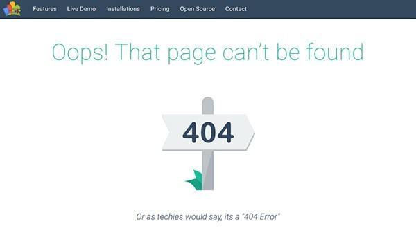
404 errors are page not found errors or broken links. They can occur when pages/posts have been moved or removed. So Google, Bing, and Yahoo search engines crawl or index your website off and on all the time. If you happen to change the post name or id and that page has been indexed by the search engines, you end up with a 404 Page Not Found error.
These errors can affect your site SEO and your ranking. In order to fix these, you first have to find them. There several ways to find them. If you have your website set up in Google Search Console or Bing Webmaster Tools you can find 404 errors there.
In Google Search Console click on “Coverage” in the left pane, then “Excluded” at the top on the right pane. Once you do that scroll down and you’ll see all the pages that have been excluded from Google. What you will want to look for is “Soft 404”. On the right, you see the number of them and if you click on Soft 404 will see the actual pages generating them.
In Bing Webmaster Tools you’ll click on “Reports and Data” then “Index Explorer”. In the right pane you’ll click on “404 Errors”, then click your website name.
If you have any 404 errors you’ll want to fix them if you can. You’ll probably recognize them as something that you changed at some point in time. Nevertheless, if you have a number of them you’ll want to fix them if possible.
Fixing 404 Errors

Here’s a quick step-by-step process you can use to fix these.
- If you don’t have a plugin that handles 301/302 redirects, install the “301 Redirects” plugin. This plugin will allow you to redirect the URL generating the error to a valid URL.
- Take them one at a time and determine whether it’s a page that has been permanently moved (301) or temporarily moved (302).
- Go to the 301 Redirect plugin and click on “Configure Redirects”. Then click on Add Redirect.
- If the page has permanently moved you’ll choose Redirect type 301 (The Default) or 302 if it’s only temporary.
- Enter the 404 error URL on the left side, then on the right, choose the page, post, media, or enter a custom URL you want the problem page to redirect to.
- Click Save, and that’s it. Your 404 error is fixed. You can test this by entering the problem URL into your browser and verifying that it redirects to your target page.
- Go back to step 2, then Rinse & Repeat.
If You Don’t Use Google Search Console or Bing Webmaster Tools
First of all, I would recommend you set up your website in both of these tools. Once you do, you’ll want to submit your Sitemap.xml. Your All-in-One SEO plugin has a sitemap.xml add-on you can activate for free. If you use Yoast SEO, it has a similar feature. Usually, your sitemap URL is Yourwebsitename.com/sitemap.xml, but double-check in the SEO tool you use.
It will take Google and Bing a while to crawl your site. So, in the meantime, you can use a plugin called “Broken Link Checker”. Install the plugin and run the scan. If any broken links are identified you can fix the link right within the console. Note that you’ll want to Deactivate this plugin when it’s not in use.
Improving Website Navigation

Website navigation can sometimes be tricky, depending on how your site is organized. You don’t want to make it over-complicated. So, if your website is fairly new you’ll want to keep it simple with a single click navigation bar across the top. The goal is to keep navigation simple and straight-forward.
For a smaller site, the menu bar will usually this will consist of a Blog link where your posts will be shown, a Home link (if you use a static homepage), About me, Affiliate Disclosure (if you sell through affiliate links), and a Privacy Policy. If you have a Terms of Use page it can go in the footer if necessary.
If you use a sidebar on your site, you can include a search option there or put it in your menu bar, depending on your theme. You can also add a Category section to the sidebar if you need further navigation options. Just don’t make it overly complicated.
If your site is larger with more categories, you can add these to the top menu bar as well. If you have a lot, you could also create a category drop-down menu.
Responsive Themes
When we talk about how to improve a WordPress website the one thing you’ve got to have in a Responsive theme. What do we mean by responsive themes? Basically you want a theme that is light-weight, meaning that it loads quickly and looks good on both desktop and mobile devices.
Everyone has an opinion here. There are a lot of themes out there. However, many of the free themes may not be as responsive as some paid themes. The key is to do some research and find a good responsive theme from the get-go. It gets more difficult to change themes once you have a lot of content and have the look that you like.
In my opinion, GeneratePress is a great theme. You can use their free version or upgrade to the premium for cheap. It has a lot of options and will allow you to customize your site nicely. Again, that’s my opinion. Do your own research and make sure you’re using something that’s responsive and flexible.
Themes That Give You Creative Control
If you’re looking for a theme that gives you enhanced capabilities and some really creative options there are really only two paths I’d recommend. Elementor or Divi. I recommend you watch their videos, both are very nice premium products and take your website to new levels.
Both of these options also give you a lot of control over how to display our website on different devices such as desktops, tablets, and mobile devices.
Elementor is plugin based. You can install the free Elementor plugin directly from the add plugin menu. If you decide you want to go Premium, just click on the Go Premium link in your WordPress Dashboard. I use Elementor Premium and couldn’t be more pleased with it.
I will say that some themes play better with Elementor than others. GeneratePress works very well with Elementor. If you choose GeneratePress and Elementor, be sure and choose an Elementor based look from the GeneratePress Library in your WordPress Dashboard before you start designing with Elementor.
Divi is a theme that includes all the creative tools in one package. It’s a little bit easier to set up and get started, but overall works much like Elementor. The biggest difference is pricing. Divi costs a little more, but you can use it on unlimited websites. GeneratePress is cheaper for the 1 website option, but you can pay the difference and upgrade later.
Unwanted Indexed Items

Attachments
I ran into this little issue on one of my first WordPress websites. Whenever you upload an image in WordPress, WordPress creates a link to the image. Nothing inherently wrong with this except in that case that you don’t want a bunch of indexed images showing up in the search engines.
For most websites, unless you are a photographer, you don’t want this because you end up with search results that link to a single image instead of your articles. In that case, a reader searching for your content will be presented with a single image that can be meaningless by itself and your reader will quickly click off your site.
What you really want is two-fold. First, you really don’t want them indexed in the first place and if they are indexed you want the image URL to redirect to its parent post which much more sense.
To set your media files to default to no-index you can simply go to your All-In-One SEO general settings and scroll down to No-Index options and select “Media and Attachments”, then save your settings. Yoast has a similar setting. No-Index simply tells the search engines not to index the corresponding item.
Now to address the other issue and have your media and attachment URLs redirect to their parent post you have two options.
- Use the simple plugin called “Attachment Pages Redirect”, no configuration required. If you don’t want another plugin, go to step 2.
- Both All-In-One SEO and Yoast will allow you to redirect attachments (media and other attachments). In AIO SEO its located under Advanced Options at the bottom of General Settings. In Yoast, it’s located under Search Appearance. You’ll want to toggle this option ON or check the box.
The only gotcha in this process is if you uploaded your images ahead of time, WordPress won’t know which post your image or attachment belongs to. In that case, it will simply redirect to your home page.
If you want the attachment to redirect to the correct post, you’ll need to go to Media in your WordPress Dashboard and attach each image to it’s associated post. This is easy to do for all newer images, but for older ones, it could be a task.
Other Items You Probably Don’t Want Indexed
In addition to media files, there are some other items that don’t make a whole lot of sense to have indexed. You can disable these in the No-Index settings for both AIO SEO and Yoast.
- Tags
- Categories
- Date Archives
- Author Archives
- Search Page
Additional Resources
How To Avoid Affiliate Marketing Mistakes And Fix The Problems
The Top 5 Affiliate Marketing Tools
Wrapping Up
When it comes to how to improve a WordPress website there are quite a few things to consider. From the layout, fonts, and colors, to the unexpected errors that can occasionally pop up.
We’ve also learned a little about Elementor and Divi and how these full-featured themes and plugins can allow you to unlock your own creative genius and take your website to the next level.
To Your Massive Success,
Michael
PS. Please scroll down and leave your comments and questions. I’d love to hear from you.

I’d like to recommend adding INK for All to the list:http://bit.ly/2IiHXlQ I’ve only been trying this tool for maybe a month or maybe a few weeks but so far, it has been incredibly useful.
Hi Amelia. I will check into it
Thanks,
Michael
Fantastic article, I found myself reading it in depth to help myself with my own websites. You touched on a vast amount of categories that were all helpful and very easy to read. My only suggestion would be to move your first pic of the 404 error down a little because at first glance I actually thought the page didn’t load and left. Consider dropping it down a little so it doesn’t get mistaken and you don’t lose readers. Besides that it was a very good site and I thank you for your insight and help.
Ha, I didn’t think about that! I’ll have to find a different featured image or put up some classic text like “There’s nothing wrong with this web page…”
Glad you found the information useful.
Michael